
Why Most Divergence Indicators Fail
Before understanding what makes the VDubus indicator different, it helps to understand what makes every other divergence tool similar.
The 2-Point Problem
Standard divergence detection compares two points — a price pivot high or low against a corresponding momentum pivot — and draws a line if they diverge. That’s it. Two points, one line, one signal. The problem is that price generates swing pivots constantly, and a simple two-point comparison will catch virtually every one of them.
The result is a chart full of signals, the overwhelming majority of which lead nowhere. Traders then try to manually filter these signals using confluence tools like trend lines or support and resistance, which is useful, but still leaves the core signal quality problem unsolved.
The Repainting Issue
Many popular divergence scripts repaint. A signal appears, looks clean, and then quietly disappears or moves as new candles form. By the time you look back at the chart, the history looks perfect — because it was silently redrawn. This creates a false sense of backtested accuracy.
The Vdubus indicator uses confirmation lag — it waits for the full pattern structure to complete before drawing anything. This means no repainting, but it also means you are always entering after confirmation rather than at the exact turning point. That trade-off is worth it.
No Momentum Physics
Most tools measure whether momentum diverges from price. Very few measure how momentum diverges — whether it’s decaying across multiple waves in a structured way, or just making a random two-point mismatch. Without this distinction, the divergence concept is being applied without any physical basis for why it should predict a reversal.
Comparison: Vdubus vs. Standard Divergence Tools
| Feature | Standard RSI/MACD Divergence | Vdubus Divergence Wave Pattern Generator |
|---|---|---|
| Signal Basis | 2-point comparison | 3-wave geometry + momentum decay |
| Repainting | Common | No (confirmation lag only) |
| Context Dashboard | None | Built-in momentum dominance veto |
| Pattern Types | Regular / Hidden | Standard, Climax, Rounded, Predator |
| On-Price Display | Rarely | Yes — directly on price structure |
| Named Geometries | None | Structured and labeled |
| Noise Filtering | Minimal | Built into the wave logic |
What Is the Vdubus Divergence Wave Pattern Generator?
The Vdubus (Vubis) Divergence Wave Pattern Generator V1 is a free, open-source TradingView indicator by author vib dubis, released in December 2025. It earned an Editor’s Pick designation on TradingView shortly after launch and has been gaining rapid visibility in the divergence trading community.
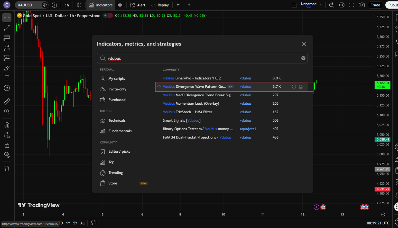
How to Add It to Your Chart
- Open TradingView and pull up any market on any timeframe.
- Click Indicators in the top toolbar.
- Search for “Vubis Divergence Wave Pattern Generator V1”.
- Select the version by vib dubis — there are clones appearing. Get the original.
Once loaded, the first thing you’ll notice is that the patterns appear directly on price, not in a separate pane below the chart. This is intentional. The indicator connects divergence to actual price structure — to the levels where trades are entered and managed, not to an abstracted oscillator below.
The Core Philosophy: Geometry + Physics
The indicator operates on two simultaneous layers:
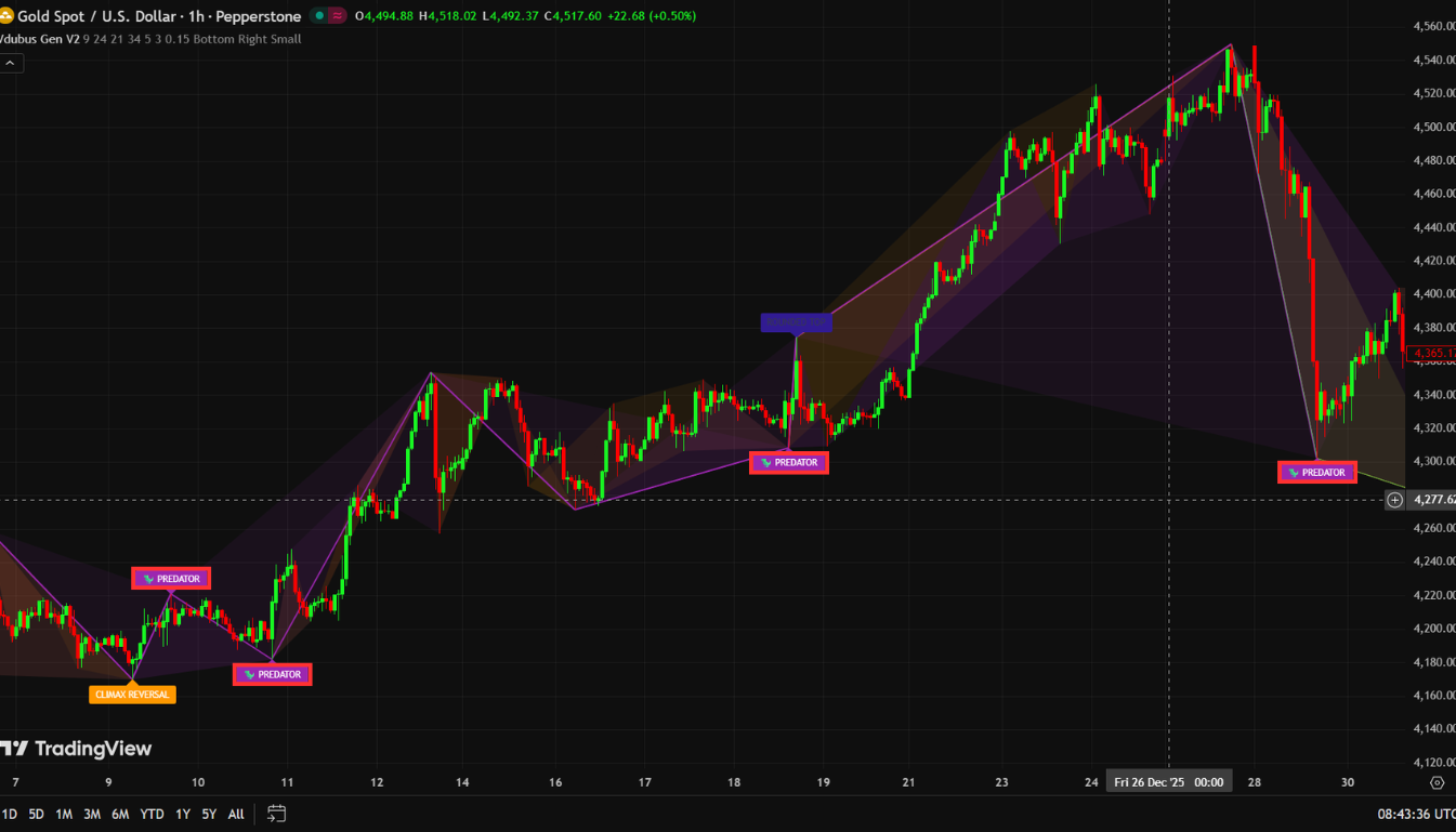
- Geometry — It uses a ZigZag-based pivot detection system to identify meaningful price swing points. These are not arbitrary candle highs and lows, but structurally significant pivots.
- Physics — It runs a custom MACD-based momentum analysis across three waves to detect decay, collapse, or continuation signatures at those pivots.
When both layers align — when price structure and momentum behavior agree — a pattern is drawn. When they don’t, nothing appears. That’s the filter most other tools skip entirely.
Default Settings
The indicator ships with four main inputs:
- Fast Length: 8
- Slow Length: 21
- Signal Length: 5
- Look Back: 3
These defaults are calibrated well for most markets and timeframes. The author’s recommendation — which holds up in practice — is to start with these before making any adjustments.
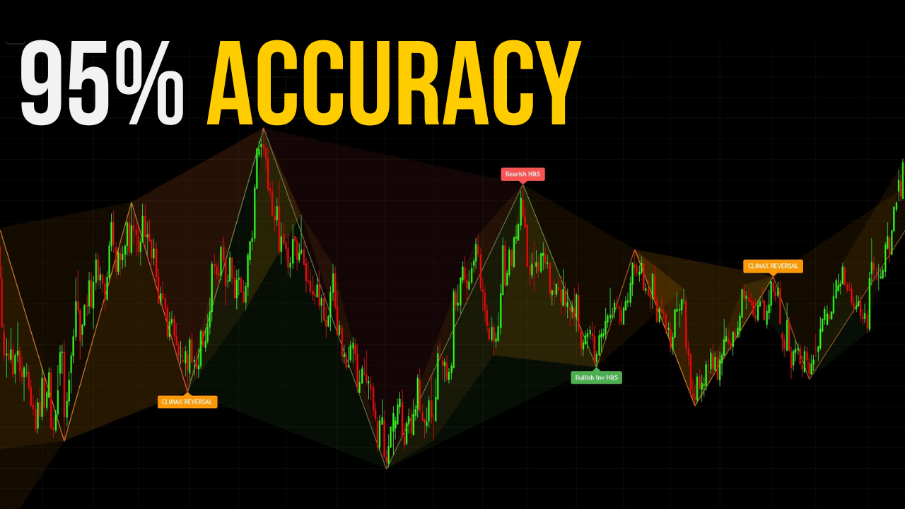
The 4 Distinct Pattern Types — Detailed Breakdown
This is the core of what separates the Vdubus indicator from every generic divergence script on TradingView. Each of the four pattern types reflects a different price geometry and a different momentum behavior. Understanding the distinction between them is what separates informed use from random signal-taking.
Pattern #1 — Standard Reversal (Green = Bullish / Red = Bearish)
The Standard Reversal is the foundation signal — the bread-and-butter setup most divergence traders are looking for when they first search for an indicator like this.
What it looks like: Green labels on a bullish setup, red on bearish. The pattern appears directly on the price pivots involved.
What’s actually happening: Price makes three swing pivots — a first peak, a middle peak, and a final peak. The middle momentum peak is weaker than the first. This is not just divergence between price and an oscillator — it’s divergence with a specific momentum decay structure baked in.
The indicator is identifying a situation where price tried to extend, tried again, and kept trying — but the engine was losing power each time. By the third attempt, the move is running on fumes.
When to watch for it: Trend exhaustion zones — after extended moves in Forex majors during London/New York sessions, at key resistance in crypto, at technical levels in indices. The pattern doesn’t care about asset class. The momentum physics apply universally.
Common mistake: Entering on the pattern itself rather than waiting for the higher low that forms after the pattern completes. The pattern is context. The higher low is the trigger.
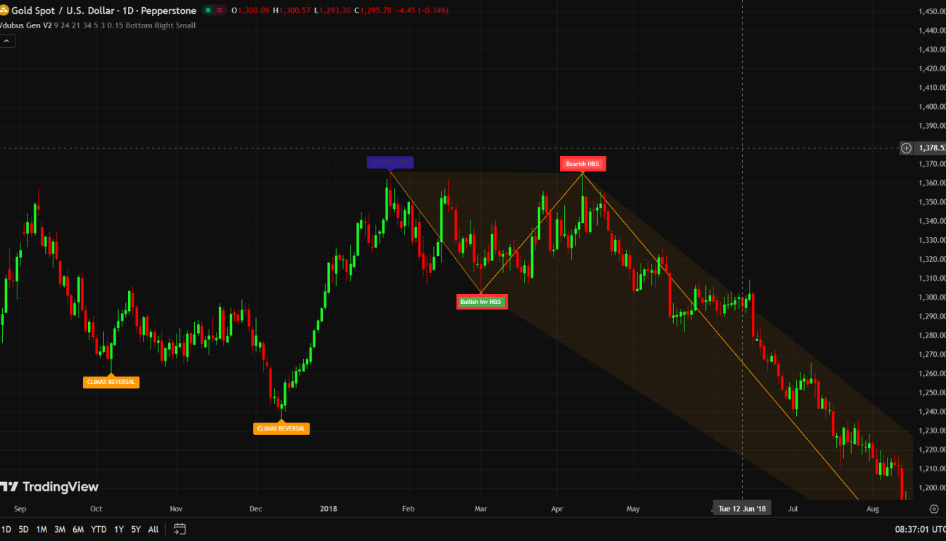
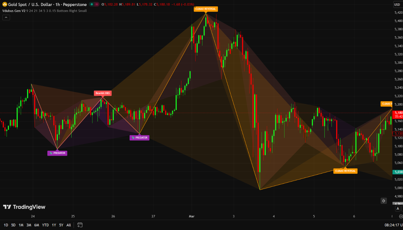
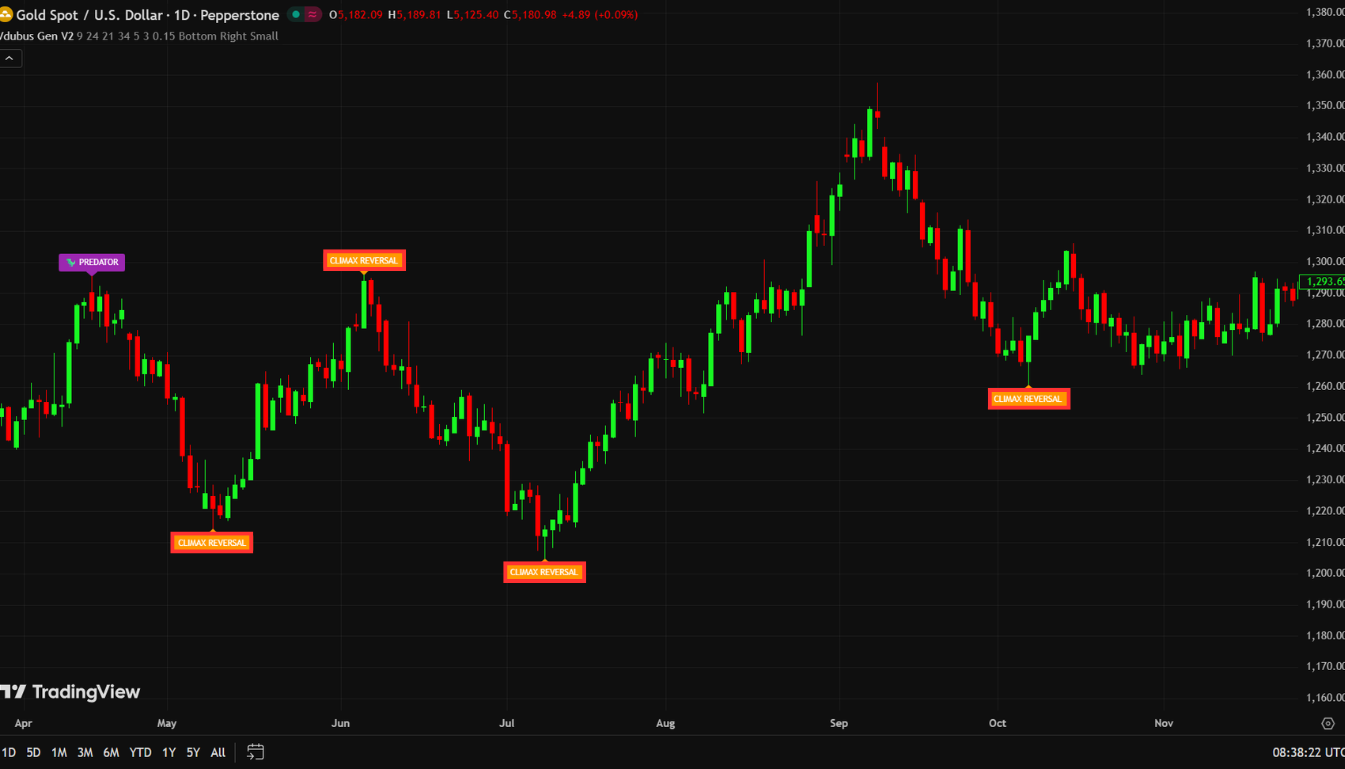
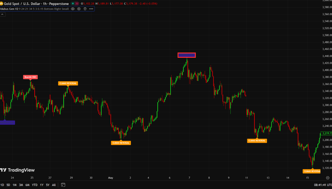
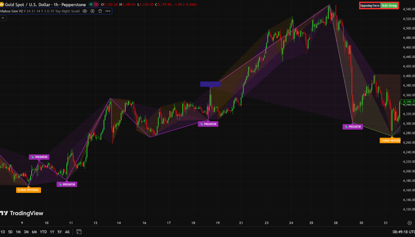
Pattern #2 — Climax Reversal (Orange)
The Climax Reversal is built to catch traps — and it’s one of the more valuable patterns in the indicator for that reason.
What it looks like: Orange labels. Often appears after what looks like a powerful, convincing price move.
What’s actually happening: Momentum fails to confirm a price extension — and then collapses. The candles look strong. The move looks real. But underneath, the momentum signature is telling a completely different story.
This is the fingerprint of smart money exiting while retail participants are still piling in. The move appears legitimate to the naked eye. It isn’t. The indicator’s three-wave filter catches the collapse before it’s obvious on price.
Real-market behavior: Climax Reversals are common at earnings-driven spikes in stocks, at manipulation wicks in crypto, and at false breakouts above key levels in Forex. If you’ve ever been stopped out by a candle that spiked through your level and then immediately reversed — a Climax Reversal pattern was likely forming at that exact point.
Trading it: Same framework as Standard — wait for the full pattern to complete, check the dashboard, then trade the subsequent lower high (for shorts) or higher low (for longs). Don’t chase the candles that form the pattern itself.
Pattern #3 — Rounded Top / Bottom (Navy = Bearish / Maroon = Bullish)
The Rounded pattern has a completely different character from the previous two. Where Standard and Climax tend to form at sharp pivots, the Rounded pattern is defined by its gradual nature.
What it looks like: Navy for rounded tops, maroon for rounded bottoms. The geometry is arc-shaped rather than V-shaped.
What’s actually happening: Price compresses and momentum decays across four consecutive waves — not sharp pivots reversing quickly, but a slow, rolling fade. This is distribution or accumulation happening in slow motion. Instead of a decisive reversal, you get a quiet, extended process that resolves into a large move once it completes.
Why this matters: Rounded patterns often precede the biggest sustained moves because the setup builds for longer without triggering obvious stop hunts or causing early entries. By the time price breaks out of a Rounded Bottom, momentum has been coiling for multiple waves. The release tends to be powerful.
Practical note: These patterns take longer to complete. Patience is required. If you see a Rounded Bottom forming with a green dashboard, that’s a situation worth monitoring closely across multiple candles rather than looking for an immediate entry.
Pattern #4 — The Predator (Purple)
The Predator is in a different category from the other three patterns, and understanding that difference is critical.
This is not a reversal signal. It is a trend continuation signal.
What it looks like: Purple labels. Appears during healthy pullbacks within established trends.
What’s actually happening: Price makes a higher low — the normal behavior of a healthy uptrend — but momentum makes a lower low. This is hidden divergence in the direction of the trend. Hidden divergence, when correctly identified, is one of the highest-probability signals in all of technical analysis, precisely because it tells you that the pullback is losing momentum while the trend structure remains intact.
When the purple Predator pattern appears in an uptrend, the market is communicating: the pullback is likely finished, and the trend is about to resume with renewed force. The word “Predator” is apt — it hunts traders who try to fade the trend at exactly the wrong moment.
Why most traders miss it: Retail traders are conditioned to look for reversals. Hidden divergence is a continuation signal, which runs against the instinct to find turning points. Most divergence tutorials focus exclusively on regular divergence (reversal). The Predator rewards traders who think about divergence in terms of trend confirmation rather than trend fading.
Trading it: In an uptrend, wait for the purple pattern to complete on a pullback. Confirm with the dashboard (green or neutral). Enter long when price forms the next higher low after the pattern. Stop below the pullback low. Target the continuation of the prevailing trend.
Don’t fade it. Trade with it.
The Dashboard: Your Safety Filter and Veto System
In the upper corner of your chart, the Vdubus indicator displays a small dashboard box. Many traders glance at it and move on. That’s a mistake.
This dashboard is not a decoration. It is a veto system.
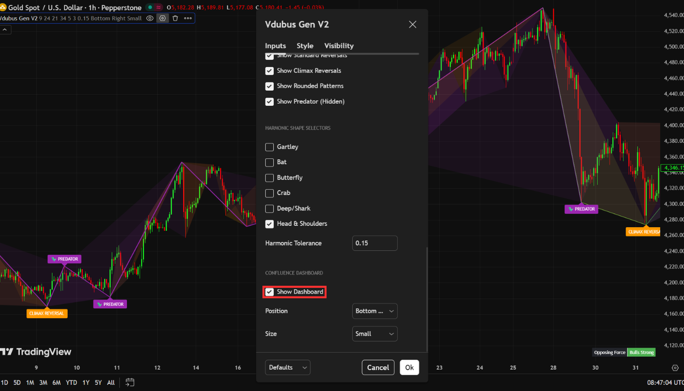
How It Works
The dashboard measures momentum dominance by analyzing recent peaks across the most recent market structure. It outputs a simple reading: bullish (green) or bearish (red). This tells you whether buying or selling pressure is currently dominant in the market you’re watching.
The Core Rule
Pattern + dashboard alignment = a trade worth taking. Pattern without dashboard alignment = a pass.
If you see a bearish red reversal pattern but the dashboard is showing strong green, the indicator is warning you that you may be trying to fade a trend that isn’t finished. You might be right about the divergence. You are probably wrong about the timing. The dashboard is the context layer that tells you whether the environment supports your trade.
Mid-Trade Management
The dashboard’s value doesn’t end at entry. If the dashboard flips color while you’re in a trade, that is a signal to start managing your position:
- Begin tightening your trailing stop.
- Consider taking partial profits at the next obvious level.
- The momentum context has changed — your edge in that trade has narrowed.
This is one of the more underappreciated features of the indicator. Most traders use it only at entry and ignore it afterward. Using it for mid-trade management gives you an ongoing read on whether the conditions that justified your entry are still present.
Settings and Market-Specific Tips
The Defaults (Start Here)
The four inputs — Fast Length (8), Slow Length (21), Signal Length (5), Look Back (3) — are the author’s calibrated starting point. They work well across a surprisingly wide range of markets and timeframes without modification. Resist the urge to over-optimize before you understand how the defaults behave in live conditions.
Market-Specific Adjustments
Forex (Major Pairs) The defaults perform well, especially during the London and New York sessions when momentum is cleanest and price structure is most reliable. Avoid trading patterns that form during the Asian session overlap if you’re on lower timeframes — liquidity conditions can distort the wave geometry.
Cryptocurrency Patterns can form and fail quickly in crypto, particularly on lower timeframes. Consider tightening Look Back to 2 if you’re trading the 5-minute or 15-minute charts. Critical rule: always wait for the full pattern to complete before considering an entry. Crypto’s volatility means incomplete patterns can reverse sharply before confirming.
Stocks Stick to higher timeframes — 1-hour and above. The geometry works on stocks, but intraday noise on individual equities can be aggressive enough to generate false-looking pattern signals that clean up on the daily. Give the pattern room to breathe.
Gold (XAU/USD) Divergence hits hard and fast on Gold. Require strong dashboard alignment before entering any Gold divergence setup. A weak or neutral dashboard reading on Gold is not enough — the speed of moves means a half-signal can turn into a full loss before you can react.
Step-by-Step Trading Guide: Long and Short Setups
The Long Setup (Bullish)
Step 1 — Pattern Completion A green bullish pattern appears and is fully drawn. “Fully drawn” is the key phrase. Do not enter on a pattern that is still forming. Wait for the final pivot to confirm. Incomplete patterns have not yet passed the indicator’s geometric validation.
Step 2 — Dashboard Check Look at the dashboard. Green or neutral = proceed. Strongly red = skip the trade, regardless of how clean the pattern looks.
Step 3 — Wait for the Higher Low After the pattern completes, wait for price to form a higher low. This post-pattern higher low is your actual entry signal — not the pattern itself. The pattern gives you the context. The higher low gives you the trigger.
Step 4 — Entry and Stop Enter long at the higher low. Place your stop below the swing low that formed during the pattern. If price breaks that level, the setup has invalidated — exit cleanly without hesitation.
Step 5 — Target Target the next obvious swing high or resistance level. These areas are where stop clusters and take-profit orders from other traders concentrate, creating natural price reaction zones.
Step 6 — Ongoing Management If the dashboard flips red while you’re in the trade, start tightening your stop or taking partial profits. The momentum context has shifted.
The Short Setup (Bearish)
The short setup is the exact mirror of the long:
- Red bearish pattern, fully confirmed.
- Dashboard showing red or neutral.
- Price forms a lower high after the pattern completes — that’s the entry signal.
- Stop goes above the swing high from the pattern.
- Targets are the next swing low or demand zone.
- If the dashboard flips green mid-trade — tighten and manage.
Same logic. Opposite direction.
Broker and Data Considerations
There’s an element of divergence trading that most tutorials skip over: your broker’s data quality directly affects the patterns you see.
Manipulated price feeds, unusually wide spreads, or delayed execution can corrupt the ZigZag pivot detection that the Vdubus indicator depends on. If your broker’s data doesn’t reflect true market structure, the geometric layer of the indicator is working with flawed inputs — and even a perfectly designed filter can’t save a trade built on bad price data.
This is especially relevant for Gold, crypto pairs with thin liquidity, and exotic Forex pairs where broker feeds can vary significantly from interbank pricing.
Before committing to live trading with any indicator, make sure your broker meets the minimum standard of clean, real-time data and reliable execution. Use BrokerCheck to compare and filter brokers side by side — including spreads, regulation, execution model, and platform support. A great setup with a bad broker is still a losing trade.
Conclusion: Why Structure Beats Signals Every Time
Most indicators give you a signal. Very few give you a reason for the signal.
The Vdubus Divergence Wave Pattern Generator earns its place on your chart not because it catches more divergence, but because it catches better divergence — patterns with structured geometry, confirmed momentum decay, and a built-in context filter that tells you whether the environment supports your trade.
The framework is straightforward:
- Use the wave geometry to identify meaningful divergence.
- Use the dashboard to confirm momentum context.
- Use the post-pattern structure (higher low or lower high) as your actual entry trigger.
- Manage the trade as the dashboard updates.
That combination — structure, context, trigger, management — is what separates high-probability setups from noise. And the Predator pattern, in particular, represents something most traders never develop: the ability to use divergence with the trend rather than always against it.
Add the indicator to your TradingView chart, test it on a demo account across multiple markets, and build familiarity with each of the four pattern types before committing real capital.