


1. Overview of Point and Figure Charts
1.1 Brief Overview of Point and Figure Charts
Point and figure (P&F) charts represent one of the oldest forms of technical analysis, having been developed in the late 19th century. Unlike traditional charting methods like candlestick or bar charts, point and figure charts do not take time into consideration. Instead, they focus solely on price movements. This distinction makes P&F charts unique because they filter out the “noise” created by small price fluctuations, allowing traders to focus solely on significant price trends. P&F charts are constructed using columns of X’s and O’s, where X represents rising prices and O represents falling prices. The chart is only updated when the price moves by a specific amount, known as the box size.
The simplicity of point and figure charts lies in their binary nature—either price is moving up or down. This feature can make it easier for traders to identify trends and key support/resistance levels. By removing the element of time, P&F charts offer a more streamlined view of the market, which is especially useful for identifying long-term trends or making decisions during periods of high market volatility.
1.2 Importance of Understanding Point and Figure Charts for Traders
For traders, understanding point and figure charts can be a game-changer in their approach to market analysis. Traditional charts often bombard traders with vast amounts of information, which can be overwhelming. P&F charts cut through this by highlighting essential data: price movements and trends. They can help traders pinpoint when the market is experiencing genuine momentum shifts as opposed to random noise.
By analyzing P&F charts, traders can spot breakouts, reversals, and consolidation phases more clearly, which helps in making informed trading decisions. These charts are particularly helpful for those who follow the “trend-following” strategy, as they are designed to track long-term price movements. Traders who rely on P&F charts often use them to set clear entry and exit points, minimizing guesswork and helping manage risk.
Moreover, P&F charts are highly flexible—they can be adjusted for different markets, time frames, and asset classes. Whether trading stocks, commodities, or forex, the simplicity of the chart remains, allowing for consistent analysis across various trading instruments.
1.3 Thesis Statement
Point and figure charts offer a unique perspective on market trends and can be a valuable tool for traders. By filtering out the noise and emphasizing price movement, P&F charts allow traders to focus on the key elements that drive markets: support, resistance, and trend direction. This article will explore how understanding and applying P&F charts can enhance a trader’s decision-making process, improve risk management, and potentially lead to more profitable outcomes.

| Subsection | Key Points |
|---|---|
| Brief Overview of Point and Figure Charts | P&F charts focus on price movement, ignoring time, using X’s and O’s to represent upward and downward trends. |
| Importance of Understanding Point and Figure Charts for Traders | P&F charts simplify analysis by filtering out noise and allowing traders to focus on significant price trends. They help in identifying breakouts, reversals, and long-term trends, thus aiding informed decision-making. |
| Thesis Statement | P&F charts provide a unique way to view market trends, emphasizing price movement and helping traders make more effective decisions. |
2. Understanding Point and Figure Charts
2.1 Basic Components of a Point and Figure Chart
Point and figure (P&F) charts differ significantly from traditional charting methods such as candlestick or bar charts. The primary components of a P&F chart include the columns of X’s and O’s, the box size, and the reversal box. The most striking feature is that P&F charts disregard time entirely and focus solely on price movement.
Each X represents a price increase, while each O signifies a price decrease. The chart will display multiple X’s in a column during an upward trend, and once the price starts decreasing beyond a certain threshold, a new column of O’s begins. The key lies in the simplicity of representation—when a price moves a certain amount (defined by the box size), it either continues the column or begins a new one.
This price-focused approach makes P&F charts clean and free of the noise that can clutter more traditional charts. There are no candlestick wicks, moving averages, or volume indicators—just pure price action, distilled into a simple form.
2.2 Box Size and Reversal Box
One of the most critical parameters in constructing a P&F chart is the box size. The box size determines the price increment needed to create an X or O. For example, if the box size is set to $1, each time the price moves up or down by $1, an X or O will be plotted. The box size can be adjusted based on the asset being analyzed and the desired level of detail. Smaller box sizes provide more granular information, while larger box sizes emphasize major price movements.
The reversal box, another crucial element, defines the threshold for switching from one column to another. If the reversal box is set at 3, the price needs to move in the opposite direction by three boxes (or three times the box size) before the chart will begin a new column of O’s after a column of X’s, or vice versa. This rule prevents small price reversals from creating noise and helps traders focus on significant changes in trend direction.
Adjusting both box size and reversal size can tailor the chart to the trader’s strategy. Smaller box and reversal sizes may help traders in more volatile, shorter-term markets, while larger box and reversal sizes work well for long-term trend followers.
2.3 How to Plot Points on a Point and Figure Chart
Plotting a point and figure chart involves updating the chart only when the price moves by the box size or greater. For instance, if the box size is set at $1, and the price increases by $1, an X is added to the current column. If the price continues to rise by $1 increments, more X’s are added to that column.
However, once the price reverses by the reversal amount (e.g., three times the box size), a new column of O’s begins, indicating a downward trend. The beauty of this system is its clarity—small price fluctuations that fall below the box size and reversal parameters are ignored, thus filtering out less meaningful market noise.
A typical step-by-step approach for plotting might look like this:
- Choose a box size (e.g., $1).
- Choose a reversal amount (e.g., three boxes).
- Update the chart by plotting X’s or O’s based on price movement.
- Start a new column when the reversal threshold is hit.
This plotting method maintains simplicity while emphasizing trend strength, making P&F charts particularly effective for identifying long-term support and resistance levels.
2.4 Advantages of Using Point and Figure Charts
One of the biggest advantages of point and figure charts is their ability to filter out market noise. Because they ignore time and only record significant price movements, they offer a clearer picture of the underlying trend. This aspect is especially appealing during periods of high volatility, where time-based charts may mislead traders into making premature or reactive decisions.
P&F charts are also excellent for identifying key support and resistance levels. Since these charts focus purely on price, patterns of consolidation, breakout, or reversal become more apparent. Traders often use P&F charts in conjunction with other technical analysis methods to confirm trends and make more informed trading decisions.
Another strength of P&F charts is their adaptability. By adjusting box size and reversal amounts, traders can customize the chart to fit their trading style, whether they’re focused on short-term movements or long-term trends. This flexibility makes P&F charts a valuable tool across multiple markets, from stocks to commodities to foreign exchange.
2.5 Disadvantages of Using Point and Figure Charts
Despite their advantages, point and figure charts have their limitations. One of the main criticisms is their lack of responsiveness to shorter-term price movements. Because P&F charts filter out smaller fluctuations, traders may miss out on minor trends or potential entry points that would be visible on a time-based chart.
Another drawback is that P&F charts can be more challenging for beginners to grasp compared to more common charts like candlesticks or line charts. The concept of ignoring time and focusing solely on price movements requires a shift in mindset, which can be intimidating for those unfamiliar with this method.
Additionally, the absence of time on a P&F chart means that certain elements important to many trading strategies, such as volume or momentum indicators, are missing. For traders who rely on these elements, the simplistic nature of P&F charts may feel limiting.
| Subsection | Key Points |
|---|---|
| Basic Components of a Point and Figure Chart | P&F charts use X’s for upward trends and O’s for downward trends, focusing solely on price movement and ignoring time altogether. |
| Box Size and Reversal Box | The box size determines the price movement required to plot a new X or O, while the reversal box defines when a new column of X’s or O’s begins. |
| How to Plot Points on a Point and Figure Chart | Points are plotted based on price movements that meet the box size threshold, with new columns created upon reaching the reversal amount. |
| Advantages of Using Point and Figure Charts | P&F charts filter out noise, highlight key trends and support/resistance levels, and can be adapted for various markets and trading strategies. |
| Disadvantages of Using Point and Figure Charts | P&F charts can overlook short-term trends, have a steeper learning curve for beginners, and omit time-based indicators like volume and momentum. |
3. Interpreting Point and Figure Charts
3.1 Common Point and Figure Chart Patterns
Interpreting point and figure (P&F) charts effectively requires understanding the unique patterns that emerge from the columns of X’s and O’s. Since P&F charts filter out the noise of minor price fluctuations, they reveal clear patterns that indicate potential trends, breakouts, and reversals.
The most common patterns in P&F charts include:
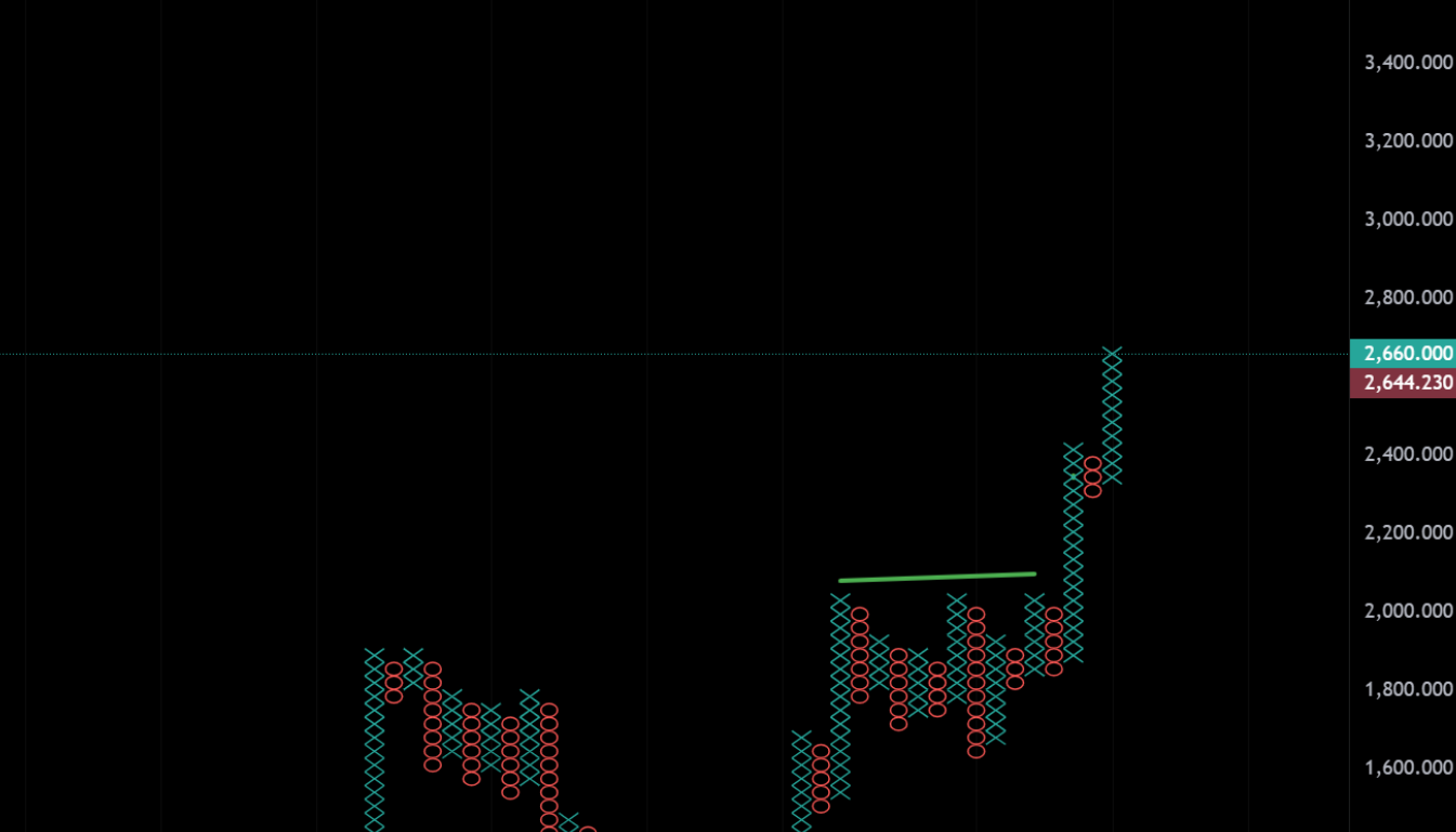
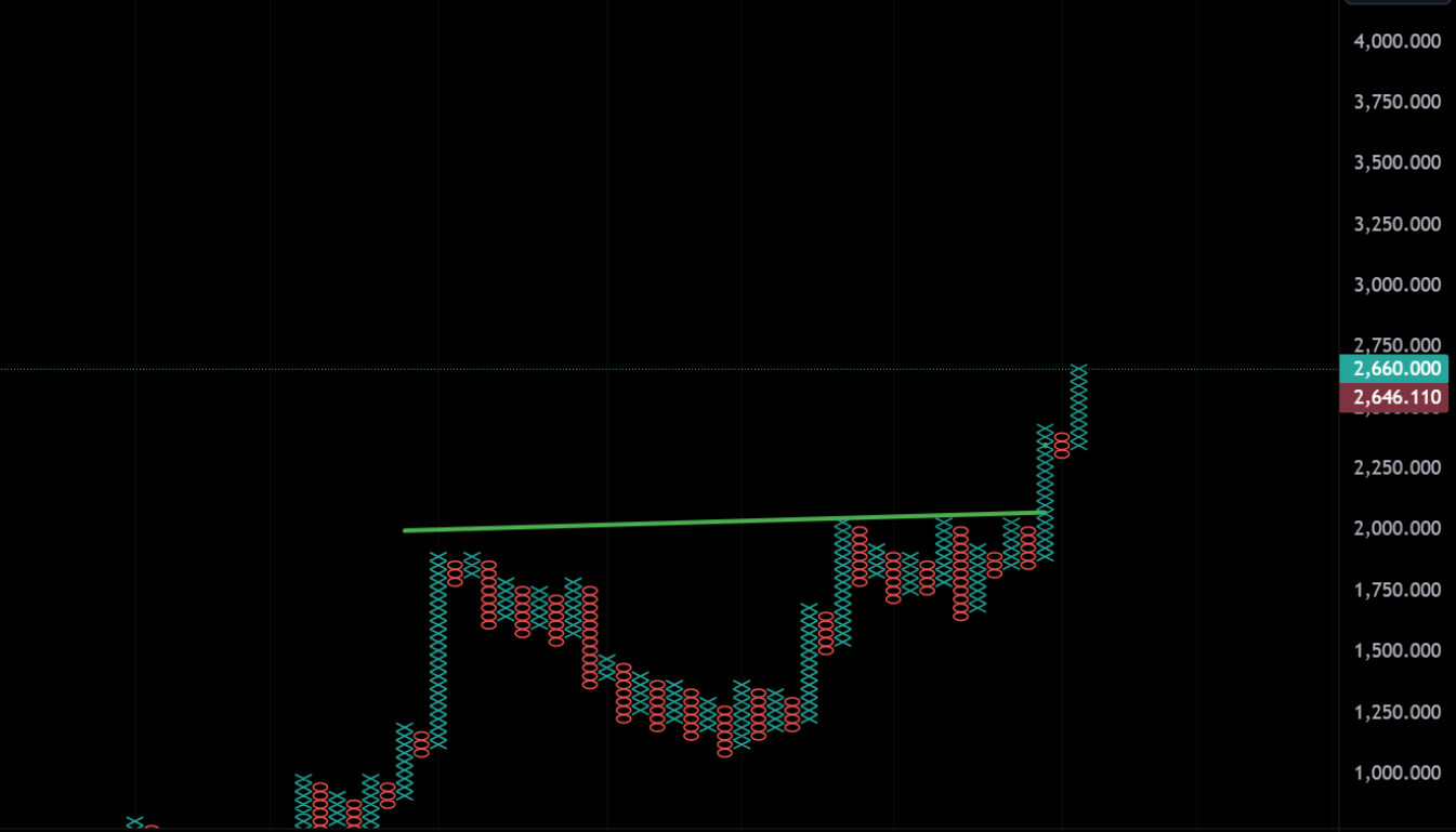
- Double Top and Double Bottom: These are fundamental patterns in P&F charts. A double top forms when a column of X’s reaches the same price level as a previous column of X’s, indicating a potential resistance level. If the price breaks above this level, it signals a bullish breakout. Conversely, a double bottom forms when a column of O’s drops to the same level as a previous column of O’s, representing a potential support level. If the price breaks below this level, it suggests a bearish breakdown.
- Triple Top and Triple Bottom: These are stronger versions of the double top and bottom patterns. A triple top occurs when the price hits the same resistance level three times before breaking out, while a triple bottom indicates support being tested three times before breaking down. Triple tops and bottoms signal more significant reversals or breakouts than double tops or bottoms.
- Bullish and Bearish Catapults: These are extensions of double or triple top/bottom patterns. A bullish catapult occurs when a double or triple top is followed by a minor pullback (represented by a small column of O’s), after which the price breaks out even higher, confirming a strong upward trend. A bearish catapult follows a similar logic in a downtrend, where a breakdown is followed by a minor upward retracement and then a sharper decline.
- Ascending and Descending Triangles: These chart patterns, commonly used in technical analysis, can also be identified on P&F charts. An ascending triangle forms when there is a rising series of higher lows in the O’s, but the X’s repeatedly hit the same resistance level, signaling a potential bullish breakout. A descending triangle shows a series of lower highs in the X’s but consistent support from the O’s, indicating a possible bearish breakdown.
3.2 Three-Box Reversal
The three-box reversal is one of the core principles of point and figure charting. It represents a change in the price direction strong enough to reverse the current trend and create a new column of X’s or O’s. When prices reverse direction by an amount equal to three times the box size, a new column is created. This simple rule is a powerful tool for traders because it helps filter out minor fluctuations and focuses attention on significant trend changes.
For example, in an uptrend (a column of X’s), a reversal occurs when the price declines by three boxes. This triggers the start of a new column of O’s. Similarly, in a downtrend (a column of O’s), the price must rise by three boxes to reverse the trend and begin a new column of X’s. The three-box reversal method helps traders avoid being whipsawed by minor price reversals that might not indicate a substantial change in trend.
3.3 Reversal Boxes and Turning Points
Reversal boxes represent critical turning points on a P&F chart. They signify when the market’s trend changes direction and are important indicators of potential trading opportunities. The reversal box is the point where the price moves against the prevailing trend by the reversal amount (e.g., three boxes). This move signals that the previous trend might be weakening and that a new trend could be emerging.
Turning points are vital because they often occur at key support or resistance levels. For instance, if a downtrend halts at a well-established support level and the price moves up by three boxes, creating a new column of X’s, this could signal a bullish reversal. Conversely, if an uptrend reverses at a resistance level, resulting in a new column of O’s, it may indicate that the trend is shifting to a bearish outlook.
3.4 Identifying Support and Resistance Levels
Support and resistance levels are crucial concepts in technical analysis, and point and figure charts provide a clear view of these levels. Support represents a price level where buying interest is strong enough to prevent further declines, while resistance is where selling pressure outweighs buying, preventing further advances.
In P&F charts, support levels are often identified by the bottoms of columns of O’s, where price movement halts and reverses to form a new column of X’s. Resistance is identified at the tops of columns of X’s, where upward momentum slows and the price reverses to form a column of O’s. These levels are easier to spot in P&F charts because the chart’s structure highlights repeated price testing at specific levels.
The clear depiction of support and resistance in P&F charts helps traders decide when to enter or exit trades. For example, breaking through a long-established resistance level might be a buy signal, while breaking below a support level might signal an opportunity to sell or short the market.
3.5 Using Point and Figure Charts to Measure Targets
One of the standout features of point and figure charts is their ability to provide clear price targets based on breakouts from chart patterns like double tops, double bottoms, and triangles. Traders can estimate the potential price movement after a breakout by measuring the height of the pattern and projecting it from the breakout point. This method is especially useful for setting price targets and stop-loss levels.
For instance, if a double bottom forms and the price breaks above the resistance level, traders can measure the height of the pattern (the difference between the highest point of resistance and the lowest point of support) and project that distance upward to establish a potential price target. Similarly, if a descending triangle breaks down, the measured height can be projected downward to estimate how far the price may drop.
P&F charts simplify this process by removing noise and presenting the patterns in their purest form, allowing traders to make objective and precise measurements of potential price moves.
| Subsection | Key Points |
|---|---|
| Common Point and Figure Chart Patterns | Key patterns include double and triple tops/bottoms, bullish/bearish catapults, and ascending/descending triangles. |
| Three-Box Reversal | A three-box reversal signals a significant trend change and creates a new column of X’s or O’s, filtering out minor fluctuations. |
| Reversal Boxes and Turning Points | Reversal boxes indicate key turning points where trends change direction, often aligning with support or resistance levels. |
| Identifying Support and Resistance Levels | P&F charts clearly show support (where price reverses from a column of O’s) and resistance (where price reverses from a column of X’s). |
| Using Point and Figure Charts to Measure Targets | Traders can measure price targets by projecting the height of chart patterns, helping in setting objectives and managing risk. |
4. Trading with Point and Figure Charts
4.1 Developing a Trading Strategy Using Point and Figure Charts
Point and figure (P&F) charts are particularly well-suited for developing trading strategies because of their clear depiction of trends, support, and resistance levels. Traders who utilize P&F charts often base their strategies on the core principles of price action, trend following, and breakouts, which are made more apparent through the chart’s construction.
A typical P&F trading strategy revolves around identifying trend reversals and breakouts. Traders can create strategies based on the breakouts from established patterns like double tops, double bottoms, or triangles, which indicate potential upward or downward price movements. For example, a bullish strategy may involve waiting for a breakout above a triple top pattern, confirming the upward trend before entering a long position.
Similarly, traders can develop bearish strategies by identifying breakdowns from double or triple bottoms or descending triangles, entering short positions after the price breaks below established support levels. P&F charts make these strategies easier to implement by clearly marking where support or resistance has been broken.
Another common strategy is the trend-following method. P&F charts help traders stick to a trend until the reversal criteria, such as the three-box reversal, are met. This helps remove emotions from trading decisions by providing clear, rule-based entries and exits.
Incorporating a systematic approach with P&F charts enables traders to stay disciplined and reduces the impact of emotional trading, particularly in volatile markets.
4.2 Combining Point and Figure Charts with Other Technical Indicators
Although P&F charts provide clear trend signals on their own, they are often used in conjunction with other technical indicators to confirm trading signals and reduce the likelihood of false breakouts. Popular technical indicators that complement P&F charts include:
- Relative Strength Index (RSI): This momentum oscillator can help traders gauge whether a market is overbought or oversold. Combining RSI with P&F charts allows traders to time their entries and exits more effectively. For example, a breakout on a P&F chart could be confirmed if the RSI shows that the asset is not overbought, indicating the breakout may have more room to run.
- Moving Averages: Using moving averages alongside P&F charts can help traders confirm trends. For example, a long position based on a P&F breakout may be supported by a moving average crossover, where a shorter-term moving average crosses above a longer-term moving average.
- Bollinger Bands: These are useful for identifying volatility and price extremes. When prices break out of the bands on a P&F chart, it can signal a stronger breakout or reversal, giving traders additional confirmation.
- Volume Indicators: Although P&F charts do not directly display volume, traders can combine them with volume indicators like On-Balance Volume (OBV) or Volume Price Trend (VPT) to assess the strength of the price movement. A breakout accompanied by a volume surge is more likely to be sustained than one without significant volume.
By integrating P&F charts with other technical indicators, traders can gain a more comprehensive view of the market and improve the accuracy of their trading strategies.
4.3 Risk Management Considerations
Risk management is essential when trading with any method, and point and figure charts are no exception. P&F charts can help traders implement disciplined risk management by providing clear support and resistance levels, which are ideal for setting stop-losses and profit targets.
One of the key risk management tools is the use of a stop-loss order, which can be placed just below the last support level or just above the last resistance level identified on the P&F chart. For example, if a trader enters a long position after a breakout from a double bottom pattern, they can place their stop-loss slightly below the breakout level, thus limiting their risk in case the market reverses.
Additionally, traders can use P&F charts to calculate position sizes based on the risk per trade. By measuring the distance between the entry point and the stop-loss level, traders can determine the amount of capital to risk on the trade. For example, if the stop-loss is 5 points below the entry, and the trader is willing to risk $500 on the trade, they can calculate their position size accordingly.
Another key risk management consideration is position scaling. Traders may scale into a position by adding to it as the trend continues and more breakout signals are confirmed, or scale out of a position to lock in profits as targets are reached.
Finally, diversification is crucial when applying P&F charts to different markets or assets. Relying on P&F charts across a diverse range of assets (such as stocks, forex, and commodities) can help mitigate risk by spreading exposure across non-correlated markets.
4.4 Case Studies of Successful Point and Figure Chart Trading
One of the most convincing arguments for using point and figure charts in trading is the success stories of traders who have effectively applied these strategies. Case studies illustrate how P&F charts can be used in real-world trading scenarios to generate profits.
- Case Study 1: The Breakout Trader: In this example, a trader focused on breakouts identified through point and figure charts in the forex market. After spotting a double bottom on a EUR/USD chart, the trader waited for a breakout above the established resistance level. Once the price broke through, a long position was taken, with the stop-loss placed just below the breakout level. The trade ran successfully for several weeks, reaching the target price based on the measured height of the pattern, resulting in a substantial profit.
- Case Study 2: The Trend Follower: Another example involves a trader using point and figure charts in the stock market. The trader identified a long-term uptrend in a major tech stock. By employing the three-box reversal method, they stayed in the trend, entering long positions after each reversal back into X’s and exiting after three-box reversals into O’s. This approach helped the trader ride the stock’s rally over several months while avoiding significant downturns, generating consistent profits.
- Case Study 3: The Support and Resistance Trader: In this scenario, a commodities trader used point and figure charts to identify key support and resistance levels in gold prices. The trader entered a long position after a confirmed breakout from a triple bottom pattern. The trade was closely managed using P&F charts to monitor any signs of reversal. As gold prices continued to climb, the trader scaled out of the position near the resistance levels indicated by the P&F chart, locking in profits.
These case studies demonstrate how P&F charts can be used to develop various trading strategies—whether focusing on breakouts, trend following, or support and resistance levels. Each case highlights the practical application of P&F chart analysis in different markets and how it can lead to successful trading outcomes.
| Subsection | Key Points |
|---|---|
| Developing a Trading Strategy Using Point and Figure Charts | P&F charts help develop strategies based on breakouts, trend reversals, and following trends, providing clear entry/exit points. |
| Combining Point and Figure Charts with Other Technical Indicators | P&F charts are enhanced by indicators like RSI, moving averages, and Bollinger Bands to confirm signals and improve strategy accuracy. |
| Risk Management Considerations | Clear support/resistance levels allow for disciplined stop-loss placements, position sizing, scaling, and diversification to manage risk. |
| Case Studies of Successful Point and Figure Chart Trading | Real-world examples show how traders have successfully applied P&F charts to forex, stocks, and commodities, resulting in profitable trades. |
Conclusion
Point and figure (P&F) charts offer traders a unique and powerful way to analyze markets, stripping away much of the noise that can cloud decision-making in other charting methods. By focusing solely on price movements and ignoring the dimension of time, P&F charts help traders to visualize trends, support, resistance, and key market patterns more clearly. As a result, traders can develop effective strategies for entry and exit, risk management, and trend-following, all based on a clear understanding of price dynamics.
Throughout this article, we’ve explored how P&F charts are constructed, how they can be interpreted, and how they can be used in real-world trading. We discussed the importance of the box size and reversal box, which are the foundation of P&F chart construction, and examined how to plot points and analyze key chart patterns such as double tops, double bottoms, and more complex formations like triangles and catapults.
Interpreting P&F charts, especially through the three-box reversal method, helps traders identify potential turning points in market trends. With clear visual representation of support and resistance levels, P&F charts provide an invaluable tool for setting precise targets and managing trades more effectively. Whether confirming a breakout or measuring potential price targets, P&F charts offer clear and objective data points for traders.
From a trading perspective, point and figure charts have proven useful across a range of markets, including stocks, forex, and commodities. Traders can develop strategies around breakout signals, trend reversals, and support/resistance levels, often integrating P&F charts with other technical indicators like RSI, moving averages, and volume indicators for more comprehensive analysis. Risk management is also facilitated by the clean, structural nature of P&F charts, which make it easy to set stop-losses and define clear exit points based on price movements.
The case studies we reviewed further emphasize how traders can apply P&F charts in different markets to create consistent trading success. Whether using the charts to identify long-term trends, manage risk, or capture breakouts, P&F charts remain a versatile and valuable tool for both beginner and experienced traders alike.
In conclusion, while point and figure charts may take some time to master, their benefits are well worth the effort. They provide traders with a fresh perspective on market trends and offer a reliable, rule-based method of analyzing price action. By learning to read and apply P&F charts effectively, traders can enhance their market analysis and improve their overall trading performance.